UX Signals for Mobile SEO in 2025: What Google Really Considers
In 2025, mobile-first indexing is no longer a novelty—it’s the standard. With over 70% of web traffic coming from mobile devices, Google has sharpened its focus on UX signals that define mobile usability. This shift compels SEO specialists and developers to rethink their approach to design, interaction, and performance, prioritising real experience metrics that matter to algorithms and users alike.
Key UX Signals for Google in Mobile Context
Time to interaction (TTI) has evolved into a critical indicator of performance. Google’s systems now evaluate how quickly users can actually engage with content, not just when the page appears visually complete. In mobile environments, slow scripts, animations, or delayed interactivity can significantly harm rankings, particularly on mid-range devices.
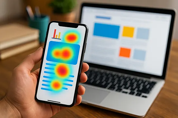
Another emerging factor is the role of mobile heatmaps. While Google doesn’t access proprietary heatmap data, it interprets behavioural signals that mimic this insight: scroll depth, tap patterns, and swipe gestures. Pages with clustered user interaction or “dead zones” can indicate poorly structured UX and reduce relevance.
Swipe UX, especially for app-style menus or sliders, must now balance flair with functionality. Google increasingly rewards interfaces that reduce friction—minimising excessive horizontal scroll, ensuring clear navigational hierarchy, and eliminating forced gestures that interrupt flow.
How These Metrics Affect Mobile Rankings
In real-world terms, a mobile site with 0.6 seconds TTI tends to outperform competitors in similar verticals with slower response rates. Fast interaction drives higher engagement and lower bounce rates—signals Google interprets as relevance and quality.
Sites optimised for thumb zones and intuitive touch areas demonstrate higher click-through on internal links, which boosts session time and depth. These patterns serve as indirect trust signals for the algorithm. UX elements like floating CTAs or tap-friendly navigation menus contribute to these positive signals.
Moreover, swipe-based interfaces that respect ergonomic flow see improved user retention. Google’s AI understands when gesture-based navigation enhances usability versus when it frustrates it. Prioritising smooth transitions and clear exit points is now a practical necessity for SEO success.
Mobile Content Adaptation for UX and SEO
Content formatting on mobile devices plays a fundamental role in SEO effectiveness. Text must be readable without zooming, and headers should structure information in digestible chunks. Walls of text reduce scannability and increase bounce rates—signals that Google’s systems monitor in real time.
Image optimisation, especially responsive sizing and lazy loading, reduces load strain. However, equally important is the context of images. Informational graphics or diagrams placed above the fold now offer more than visual support—they influence perceived page value and contribute to Google’s page quality assessment.
Video integration also needs careful UX alignment. Auto-playing content with no control interface or excessive buffering degrades experience. Structured integration—like muted previews with visible controls—has proven to maintain interaction metrics while keeping load time reasonable.
Practical Examples of Mobile Content Optimisation
News outlets like The Guardian implement collapsible article summaries, which allow users to explore depth without scrolling endlessly. This technique maintains user flow and reduces pogo-sticking—an indirect ranking signal.
Educational sites that employ sticky TOCs (Table of Contents) on mobile offer smoother navigation, keeping users engaged across longer articles. This model has become standard for long-form content where reader attention must be actively retained.
Retail interfaces like Zara’s mobile catalogue use intuitive filters that expand without loading a new page. By embedding interaction directly within the scroll experience, they reduce server requests and offer seamless UX—both beneficial for mobile SEO.

Design Choices That Influence UX Signals
Typography is often overlooked in mobile SEO, yet it plays a measurable role in user behaviour. Fonts must be legible without zooming, ideally within the 16–20px range. Google’s internal studies show that poor readability increases bounce rates, regardless of content quality.
Colour contrast and visual hierarchy also affect interaction. Clear CTA buttons with contrasting backgrounds and proximity to thumb zones drive higher tap rates. Meanwhile, breadcrumb trails that adapt responsively can support structured navigation without cluttering the viewport.
Loading indicators and transitions, though minor from a design perspective, contribute heavily to perceived speed. Skeleton loaders and fade-ins can reduce perceived delay, even if actual TTI is unchanged. These micro-interactions improve dwell time and reduce abandonment.
Impact of Design on Mobile Engagement Metrics
Sites that incorporate user-friendly design principles—such as BBC’s mobile homepage with its intuitive spacing and interactive cards—tend to experience higher user retention and repeat visits. These are long-tail signals that feed into Google’s evaluation of site trustworthiness.
Additionally, mobile-first design approaches that avoid desktop-to-mobile replication typically result in better rankings. Unique mobile designs account for one-handed use, prioritise vertical interaction, and avoid horizontal constraints—a preference that’s reflected in search outcomes.
Finally, feedback elements like in-line error messaging on forms improve task completion rates. When users encounter fewer frustrations during actions (e.g., signing up or contacting support), session success rates increase—providing Google with strong behavioural indicators of a quality user experience.
Popular articles
-
 Podcast Marketing: The New Frontier in Online Engagement
In the realm of digital marketing, trends and …
-
 Content Formats That Deliver Real B2B Value in 2026
B2B marketing in 2026 is shaped by a …
-
 How to Structure Expert Articles That Build Trust in Comp...
In highly specialised industries such as finance, healthcare, …